What's new in Xcode 14
Learn everything that’s new in Xcode 14. There are a ton of improvements both under the hood and visually, so let’s look at them and what’s coming in the new version.
Every year at WWDC Apple introduces a ton of new things. Personally, one of the most interesting bits for me is the improvements about the tooling we have as developers. This is the piece of software that we work with daily and so having quality of life improvements in that area can have a massive impact.
This year there has been some great additions that make life easier as a developer and also helps us better understand when problems occur and to get feedback from our customers.
There have been four big areas of improvement:
- Source editing and SwiftUI previews
- Multiplatform development
- TestFlight feedback and analytics
- Performance improvements
Let’s go through each of them.
Source editing and SwiftUI previews
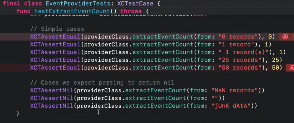
One of the most striking updates to the source editing in Xcode 14 is that function definitions and class names will be sticky on the top when scrolling through them. In the screenshot below you can see the class name EventProviderTests and the function name testExtractEvenCount at all times which is a helpful addition for navigation larger source files (which is not a great thing to have per se…but let’s stay realistic).
When having a type, such as a struct or a class Xcode is now smart enough to auto-complete an initializer and automatically assign the values to its properties. This is a tedious task and it’s amazing that this can be automated. The same thing also works for Codable methods which limits the repetitive nature of always writing the same code.
In general, recommendations for code completion have become more intelligent. Optional properties will now be shown in italics (see below) and will be omitted by default. If we start typing CardViewheader (including the name of e.g. the headerIcon parameter in this case) it will be included in the autocompleted call.
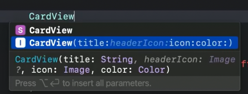
This is low-key an amazing addition. For all my SwiftUI friends, think of typing .frame with maxWidth it will create a modifier with only that parameter which alone will speed my development time by 3x (roughly).
If we click on a function form a protocol it will show all types that define this method. And even better, there is a new Callers function to see where a certain function is called. When used to this from other IDEs, finally having this feature is so great.

In addition, there has been huge improvements to regular expressions. There is an entire new framework around it but in short it will automatically detect errors in the expressions way more reliably and also has a nice syntax to construct expressions in a type-safe, beginner-friendly way.
The preview canvas for SwiftUI views has received a major re-design. It is now interactive by default so you can see live changes while making them, all while staying interactive. There are now multiple variants included through a new control allowing us to preview color schemes, text sizes (see below) and device orientation with immediate rendering.
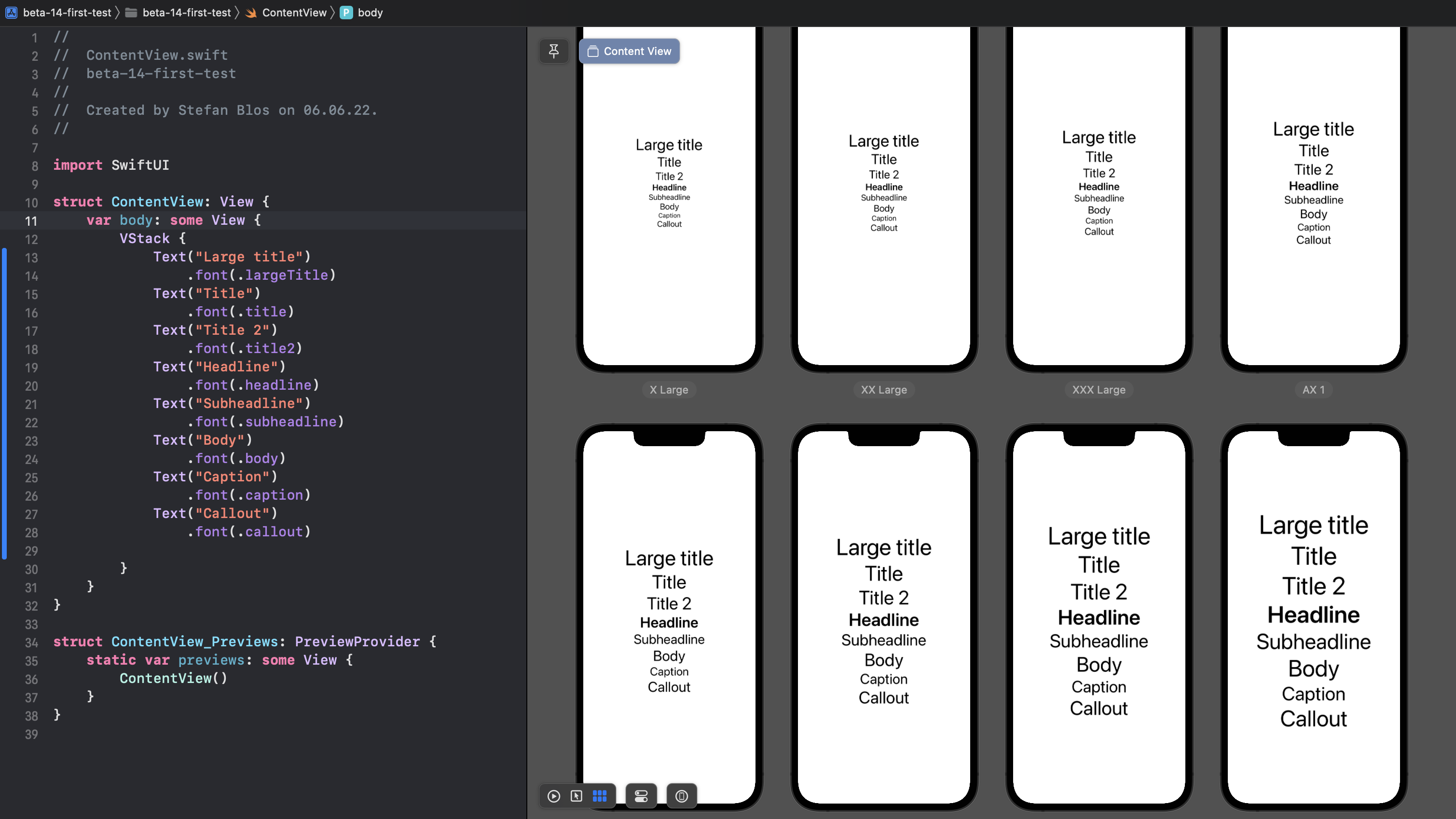
Having the side-by-side previews can really help validate layouts directly and with a click you can jump to see a certain option in more detail. There is now even less excuse to no support all dynamic type sizes in your apps, making them accessible for everyone. Hopefully stability of previews will also be improved.
The library in Xcode (shortcut to bring it up: CMD + SHIFT + L) now includes all SFSymbols. They can be accessed by entering their name in the library search (e.g. “calendar”) and hitting return. With that it will automatically be added to the the code as e.g. Image(systemName: "calendar").
There is also a new functionality where error messages are dimmed while they are being reprocessed. When they are solved they will go away after that, if not they will turn red (or in the case of warnings: yellow) again. This is a simple, yet helpful improvement to always know what’s going on.
We can now extend Xcode with Package Plugins, e.g. doing automatic formatting with SwiftFormat. These can either be added to the build phase but can also be invocated through the project navigator. It will be exciting to see what the community will come up with to extend functionality of Xcode for that.
Another interesting feature is an AppIcon of a single-size. This needs a 1024x1024 pixel image and will auto-generate the rest of the required sizes. The icon can also simply changed by double-clicking on the icon and browsing through Finder to select a new one.
Multiplatform development
One of the themes of this year’s WWDC was also that SwiftUI is “the best way to build apps on every platform” (Apple’s words, not mine). They made multi-platform development easier with Xcode 14. From there on a single target can be used to define apps. Then, only destinations need to be added as can be seen in the screenshot below.
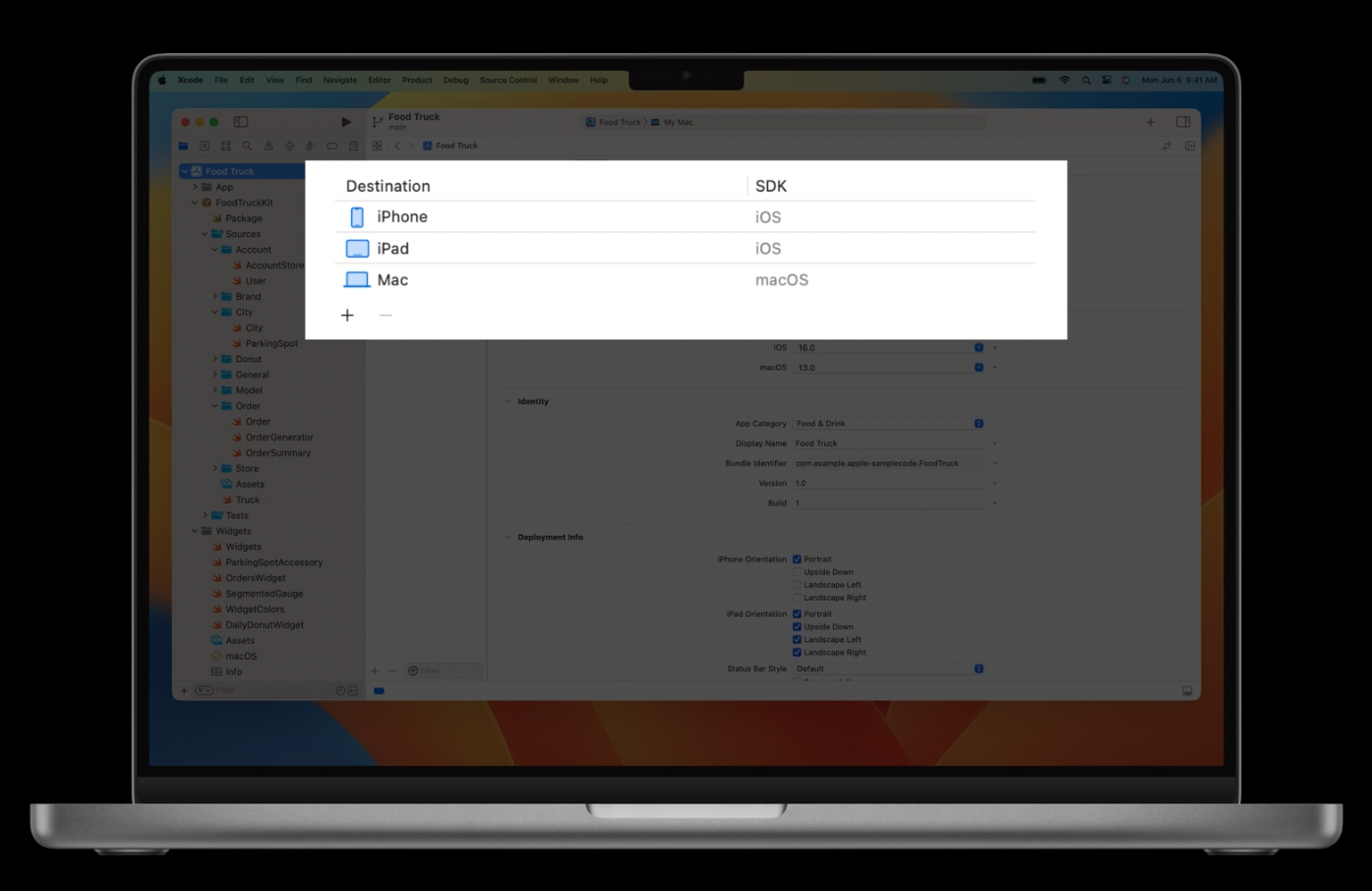
This is aimed to break up complex target situations and make it easier to focus on the code. Defining custom functionality for a platform will be easier through #if os(...) ... #else syntax. These changes are welcomed to make it even easier to build and deploy our apps for all the platforms available.
In addition there is a re-defined destination chooser. It will show all the simulators your selected scheme can run on with the most recently used ones at the top. In addition there is now a filter option to e.g. only show these devices which include the “Pro” keyword. All of these improvements also apply to the scheme chooser.
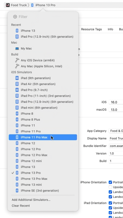
In my opinion it’s great to see that Apple is not only pushing cross-platform development but also improves the tooling around it to make it a (even) more pleasant experience.
TestFlight feedback and analytics
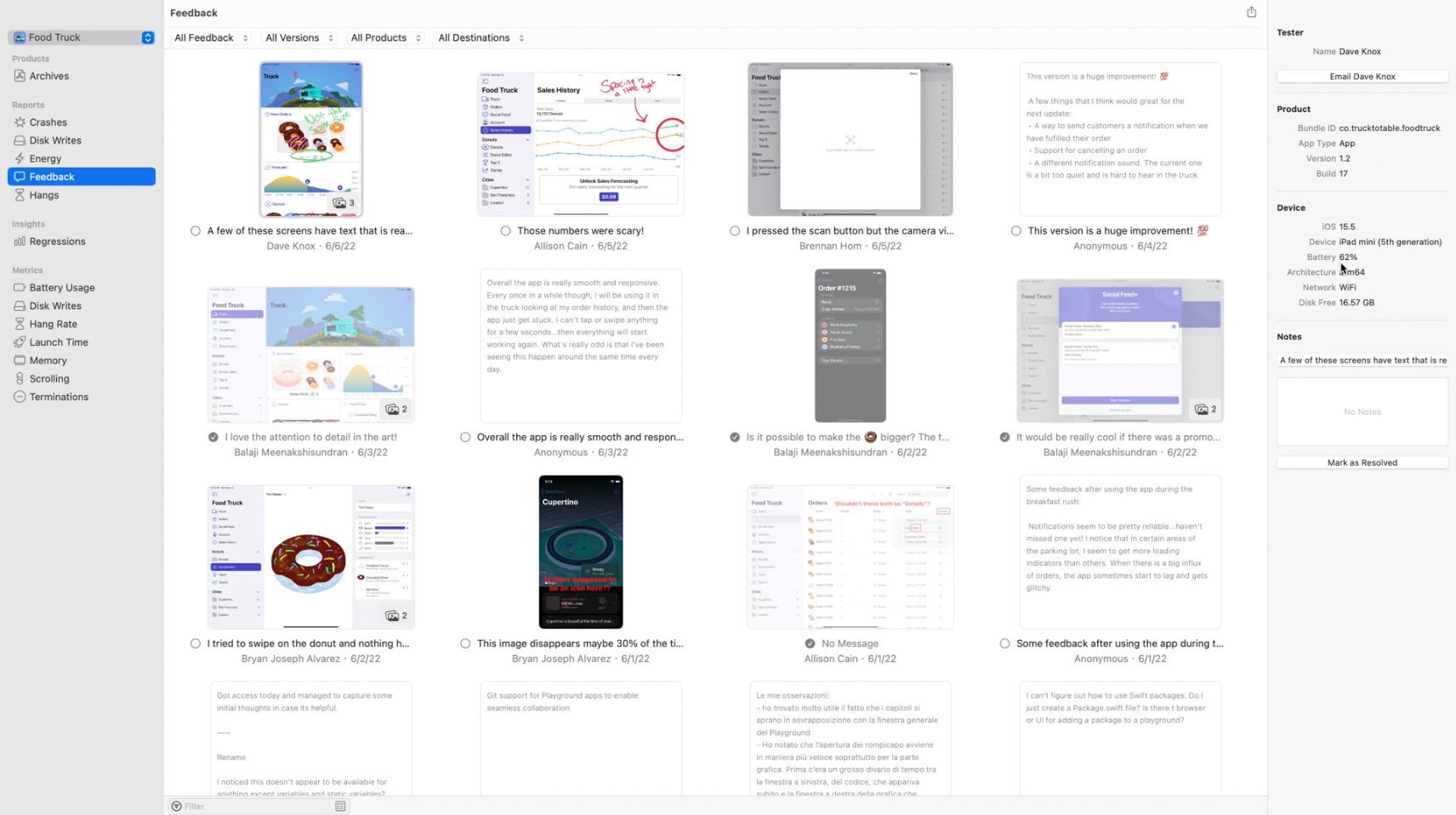
There has also been a disconnect between testers giving feedback about our apps and viewing that feedback. It is a great mechanism to allow testers to do screenshots and annotate them with information but it wasn’t great from a discoverability standpoint for developers.
That changes as the Organizer now contains a separate Feedback section. It contains a ton of information like screenshots, connected text-form feedback, detailed device information, and much more. All of this will really make integration of feedback way more easy while not needing to leave Xcode. You can even send a mail to the tester directly from there to ask for clarification, tell them the issue is resolved or simply thanking them.
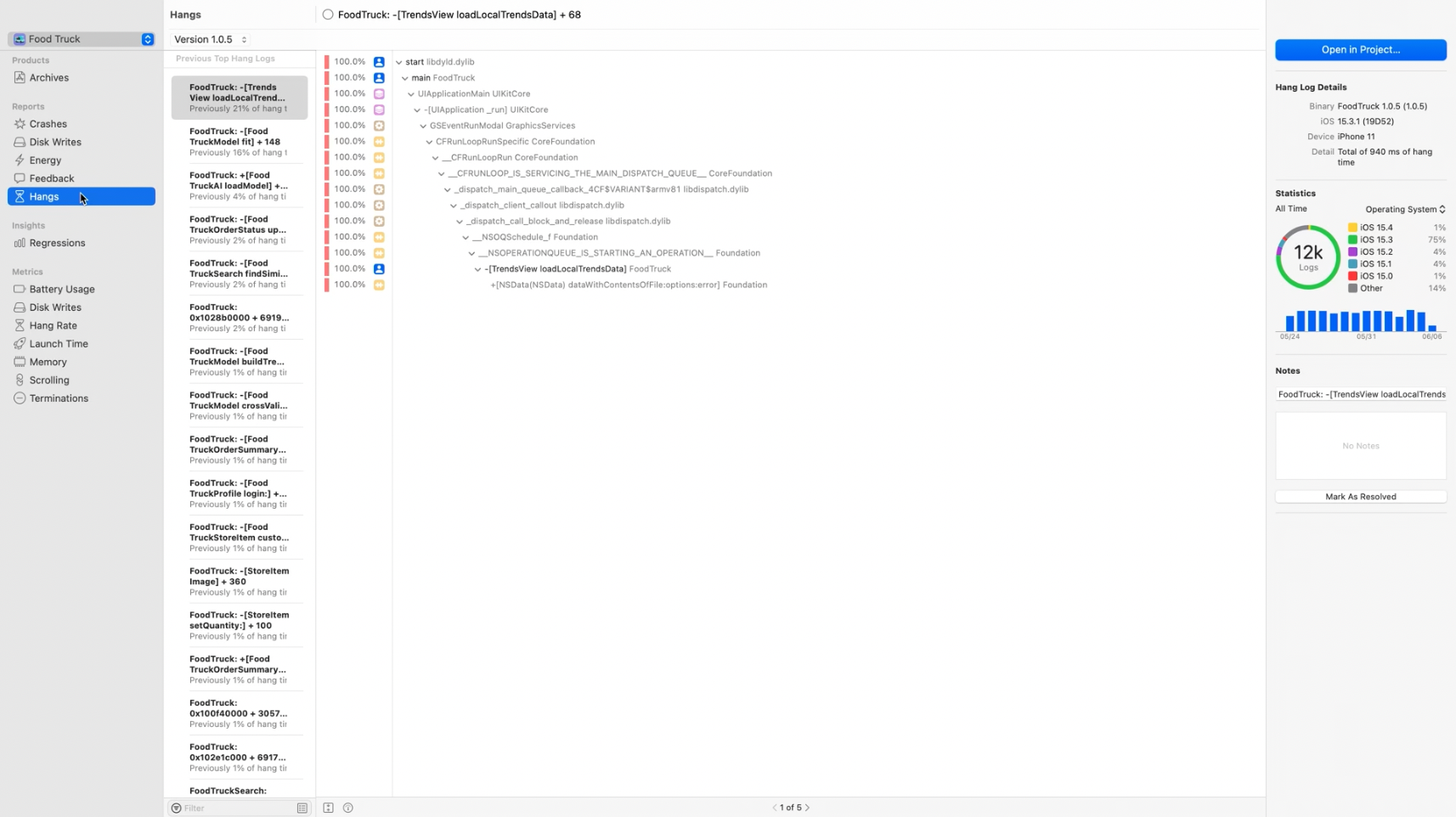
There is also a new Hangs section in the Organizer. This shows information about issues in the App Store version of our apps where the main thread was blocked. It is sorted by severity and has a ton of additional information, like varying times for system versions and more detailed statistics. We can even directly jump to the position in code where the hang occurred and make the experience for the user even better.
There are also many sessions that touch upon improved tooling around different frameworks, such as visualization of concurrency-related issues, memory debugger to make our apps smaller and many more. For more info check all the sessions that are available from WWDC.
Performance improvements
The last topic is performance improvements. While these are sometimes not as shiny to show, it is fascinating how much time we can save, by having our tools start faster and do things that happen often in less time.
Xcode 14 has a 30% faster startup time. The download and installation process becomes much faster by allowing us to download additional platforms and simulators on demand. This is noticeable as the installation and unarchiving of even the first beta was remarkably quicker than regular Xcode versions.
Internally, it also re-arranges build steps to make them way faster with improved parallelism. We get better tooling around our own build processes with a visualization of the build timeline. This makes it easier to detect longer-running phases, find bottlenecks, and optimize build-time through e.g. making tasks run in parallel.
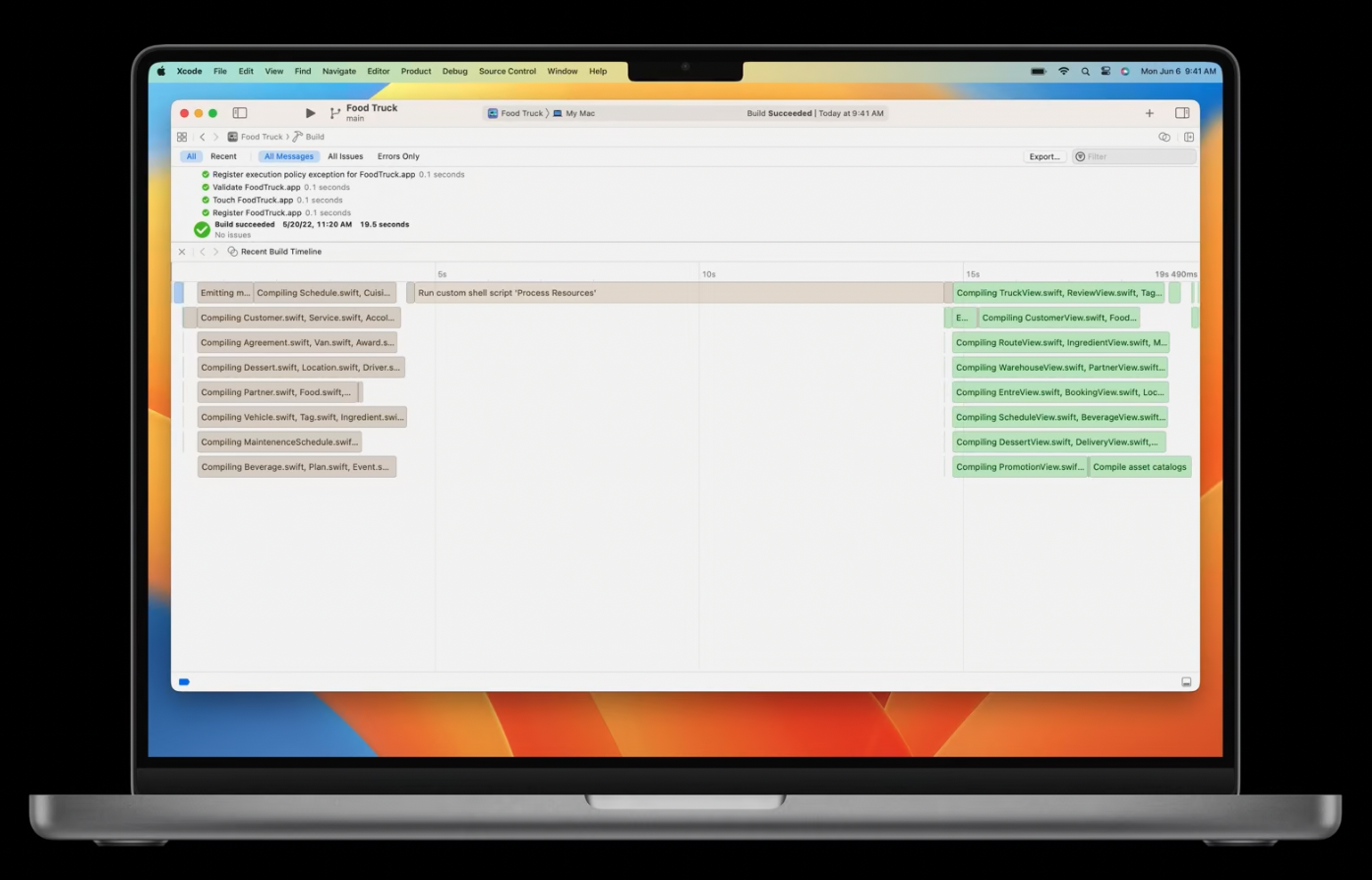
The linking process has been vastly improved, being 2 times faster and build-times can go down by 25% as a result of this. Test runs can now be parallelized more efficiently with multiple test targets which can result in 30% faster test runs.
When distributing apps, an optimization to the notarization process can lead to 4 times better performance. Also Interface Builder was improved for 50% faster document loading and 30% faster switching between devices.
Summary
There have been huge improvements in Xcode in the new version. While many of them are under the hood there are also many things that make life as a developer easier everyday. Personally, I’m really looking forward to the stable release and while some people might argue that it’s about time that certain features land, I’m just happy that Xcode is improved every year and we get nice additions.
If you enjoyed this article and want to see when new content comes out or have any questions, follow me on Twitter and reach out. I’m always happy to help.