Text in SwiftUI
Introduction to and how to use the Text View in SwiftUI.
In this ongoing series I want to analyze the building blocks of SwiftUI, which is Apple’s new, cool, and hip declarative UI Framework.
One of the most common tasks when building a UI is to display text. This is why I want to start this series with the respective element for SwiftUI which is (un-)surprisingly called Text.
We will go over different chapters on how to use Text and some of the more and some of the less common things we can do with it.
Basics: Views and Modifiers
The first thing that is important to note is that all UI elements in SwiftUI are Views. This sounds rather abstract at first but if we take a closer look this only means that they have to conform to the View protocol.
Views are structs, which means they are value types and in order to conform to the protocol they only need to have a var body which returns some View. While the some keyword is rather new it specifies an opaque return type. It has a simple meaning:
It can return any View element, we don’t need to specify which one. The only thing that is required is that it will always return the same type of element. There are ways to circumvent that restriction but it is highly recommended to structure your views in a way that this won’t become necessary.
In order to change the appearance of a View or add functionality to it we can attach Modifiers to it. A Modifier, just like its name suggests will modify the View. While this is not 100 % accurate (it will wrap your previous View and will return a new one), for now it is sufficient to think of it that way.
This sounds really abstract so here is a little snippet to demonstrate this. Don’t worry if you don’t understand it immediately, I just want to clarify the structure here:
struct ContentView: View {
    var body: some View { // 'some' = opaque return type
        Text("I am a View") // the View element
        .bold()           // modifier applied to the View
        .padding()        // another modifier
    }
}
Now that we have the basics out of our way we can come to the real stuff.
Modifying the Font (appearance)
In order to show a String on the screen we can just wrap it in a Text and it will be displayed just like this:
struct ContentView: View {
    var body: some View {
        Text("SwiftUI is awesome")
    }
}
Granted that this is not the most functional app in the world and it might not win an Apple Design award it is still nice to be able to quickly show something on the screen. By default SwiftUI will center the Text on the screen.
This is where the fun begins. We get a lot of modifiers out of the box and we will now take a look at the ones that allow us to modify the font.
The first thing we might want to do is to change the font size of our Text. Luckily enough SwiftUI comes with a .font modifier that will do just that.
Now we can set the size by using the system font like that:
Text("Text with decent size")
    .font(.system(size: 30))
This works well but comes with a drawback. It will not adapt to dynamic type. This means that if your user will choose a different default text size, e.g., due to vision impairments, your Text won’t automatically adapt.
However, Apple provides a set of default text styles which have exactly this property. With that you can, e.g., set your font to .title or .caption and achieve nice effects with these built-in options. You can, e.g., go for the largest one with:
Text("Largest built-in Text")
    .font(.largeTitle)
There’s even one more option here. You can even select one of a few given designs for your text (which you can again explore with autocomplete). This can be done in the following way:
Text("Monospaced text")
    .font(.system(.title, design: .monospaced))
Even after applying the font we can still change the weight of the font manually by setting it to one of the built-in font weights with .fontWeight(Font.Weight).
Changing the size is of course not the only modification we can do with our text. We also have the common font manipulations like bold (with the .bold() modifier) or italics (you guessed it, it’s .italic()).
You can also .underline() and .strikethrough() your text. Notice that these two modifiers come with an optional Color? parameter which even allows you to manually customize these further. So you could create a loaded headline by applying all these modifiers like this (pro-tip: don’t show it to your designer):
Text("I'm a large, styled title")
    .font(.largeTitle)
    .bold()
    .italic()
    .underline(color: .blue)
    .strikethrough(color: .green)
In addition there are also some lesser known modifications such as .baselineOffset(CGFloat). It allows you to offset the baseline of the text vertically. Positive values will offset your text to the top while negative values will move it down from the baseline.
Another less common but sometimes helpful modifier is .tracking(CGFloat). It allows you to change the spacing between letters in your Text element. A large positive value will move the letters further apart while negative values will shrink the spacing between characters (even allowing them to overlap).
Coloring your Text
Another important aspect of working with text is coloring. Fortunately, SwiftUI has you covered here. You can use the .foregroundColor(Color) modifier to select any color you like in order to color your text. To provide red text you can use .foregroundColor(.red) and for green text .foregroundColor(.green).
One interesting feature of SwiftUI is called semantic colors. For example, you have colors like primary, secondary and accentColor. The first two will indicate the importance of text through the coloring. The nice thing is that they will automatically adjust to Dark Mode. So while in Light Mode these show prominent (.primary) text in black. At the same time text of lesser importance (.secondary) will be colored in gray. In Dark Mode however that switches and .primary will give your Text a prominent light color that will stand out from the dark background.
Speaking of it there is of course also a .background modifier. With it you can again specify a color with, e.g., .background(Color.blue). You may notice that in contrast to the .foregroundColor modifier we need to explicitly state the type of the parameter, namely Color.
(Side note: the reason for that is that you can also use many other types of Views as backgrounds, such as Shape types or Images. It is important to note that you can use that modifier for almost all other Views as well. With that you get a really powerful API to create more sophisticated layouts and views.)
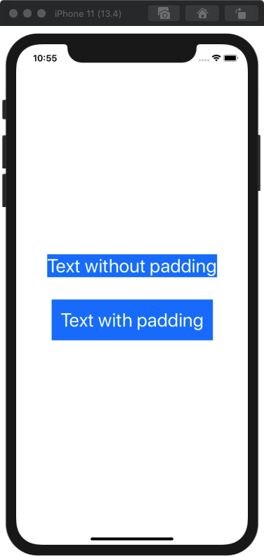
You might think that only specifying a background color looks odd since the coloring is only stretched out as far as the text itself. For that (and in many, many other cases) the .padding() modifier comes in helpful. If you combine it with the .background modifier you can achieve good-looking results with very few lines of code:
Text("Text with beautiful background!")
    .padding()
    .background(Color.blue)
You can see the results of not using .padding() compared to using it in the screenshot below:
Fitting Text into available space
Now that we leveled up on the mastery of styling our text we might want to work with more than one line of text. As Shakespeare never said (but most probably would have, if SwiftUI was available in his times): “There has never been a great app that only used one-line strings.”. So let’s take a look at how we can make our Text view cater to our needs in this regard.
When working with multiple lines of text the .lineLimit modifier specifies the amount of lines our Text can be. You can give it an Int for the number of lines or just hand it nil (which is the default) to make it adjust automatically to the input.
If you want to manipulate the space between the lines of a Text element you can do so by passing a CGFloat to the .lineSpacing modifier. Similarly you can adjust the alignment of the text with the .multilineTextAlignment modifier. This one receives a value of type TextAlignment which can be, e.g., .center or other typical cases.
For compressing the text you can also use multiple options. The first one is .allowsTightening which just receives a Bool to indicate whether the space between characters of the text can be compressed - if necessary - in order to fit text in a line. SwiftUI will automatically try to adjust space if you have an overflow.
This works best with the .minimumScaleFactor modifier. You can specify a CGFloat in order for the Text to shrink its font size down. This value needs to be in the range between 0 and 1 where a value of e.g. .minimumScaleFactor(0.5) allows the text to shrink to half the size.
If (despite everything you know now) your text is not able to fit into the given space for whatever reason, you can also specify the way it is truncated. This is done with the truncationMode modifier. It receives a value of the enum *TruncationMode* which can be .head (truncate at the start), .middle (in the middle) or .tail (default: at the end).
What have we learned today?
With that you should be perfectly equipped for using Text in SwiftUI. Not only will you now be able to find the perfect size and style of your text. Moreover you can color your text in fancy ways and make it stand out with wonderful backgrounds.
Also you have read about many of the lesser-known modifiers that you now have in the back of your head whenever you will find the need to use them.
I can highly recommend to have a look at the official documentation by Apple as it provides a great overview and additional examples.
Thanks for following along and hopefully you found something useful in this piece. If something is missing please do not hesitate to comment or hit me up on Twitter where I am @stefanjblos.
One more thing:
There is one more neat trick I have up my sleeve which you may want to sit down for. Ready? You can combine multiple Text views with the + operator. Glad you found that chair to sit down, right?
Jokes aside: while this might not seem like a particular thing standing out it offers A LOT of opportunities. For example you can chain text together with different styles. Check for example this piece of code:
Text("SwiftUI")
    .font(.largeTitle)
    .foregroundColor(.red)
+
Text("is")
    .font(.headline)
    .foregroundColor(.blue)
+
Text("awesome")
    .font(.footnote)
    .foregroundColor(.green)
Without the need for anything like NSAttributedString (which was one way to solve this task in the ancient world of UIKit) you can achieve different text styles and coloring into one UI element super easily. I think that this is remarkable! And if you want to see what is made possible by this check the tweet below (which I just spent way too much time searching for). After doing that just follow Paul because he produces awesome content.
Waiting for something to render, so obviously I need to fill my time playing around with SwiftUI text effects. pic.twitter.com/q3AaAJMBph
— Paul Hudson (@twostraws) November 10, 2019
Thanks again for reading and have a great day!