Toggle in SwiftUI
We have a look at Toggles in SwiftUI and the possibilities we have with it.

In this post we want to take a look at the Toggle View in SwiftUI. This is one of the more basic views that allows users to toggle between two states. This can be useful for e.g. a settings view where users need to decide whether to activate a certain feature or not. It could also be used in a Form that asks some properties from the user to decide betwen two options, like e.g. dark mode or light mode (read until the end to see how to do this in cool mode 😎).
We will explore the different options to configure the Toggle, how it behaves on different platforms and how we can style it with modifiers. As a bonus we will also create a custom Toggle style, which requires surprisingly few code.
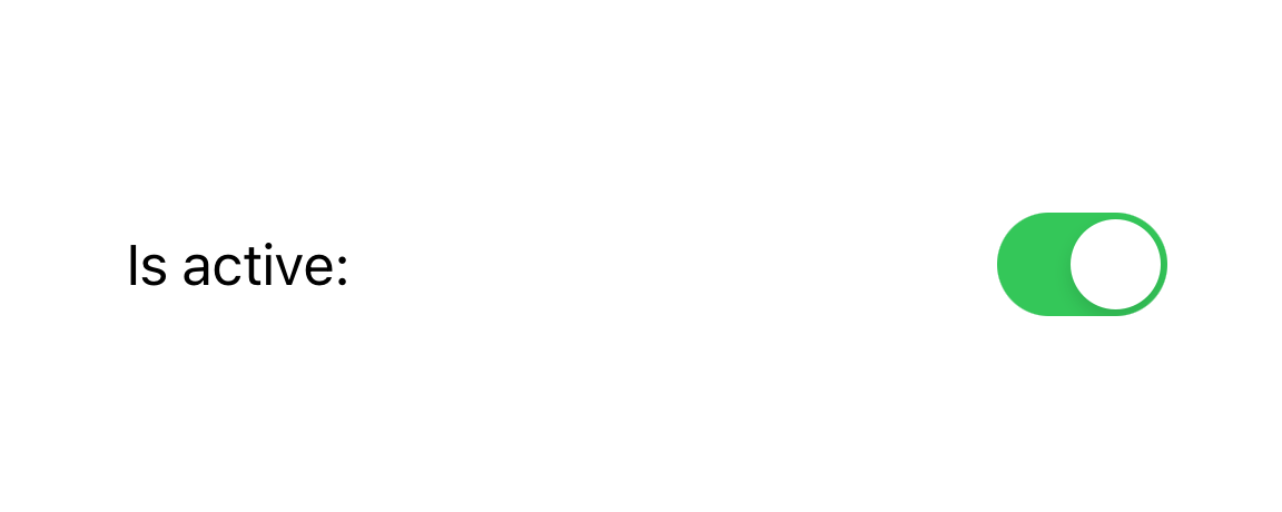
Now for everyone wondering, this is a Toggle (with an active state on the left and an inactive state on the right):


How to create a Toggle?
First, let’s take a look at how we can create a Toggle. It’s always a good idea to start at Apples documentation and there we can see that there is a few initializers to choose from.
In any case we need two things:
- A
Stringdescribing the property we can toggle - The
Bindingto aBoolvalue, that the Toggle can manipulate
Note: If you’re not sure about the difference between State and Binding I recommend reading this article on Hacking with Swift.
The initialization of a Toggle with a @State variable called isToggleActive can be done with the following code:
Toggle("Is active:", isOn: $isToggleActive)The arguments are a String (which can also be a localized String by handing a LocalizedStringKey) which describes the functionality of the Toggle and the Binding<Bool> with the isOn: parameter.
Now, let’s take a look at how we can use that in a simple SwiftUI View with a Toggle (resulting in the example shown above):
struct BasicToggleView: View {
    @State private var isToggleActive = false

    var body: some View {
        Toggle("Is active:", isOn: $isToggleActive)
    }
}
An alternative to using a String is a Label. This allows us to use the combination of an icon and a text to show as the description for our Toggle. I won’t go into too much detail about Labels here (look out for a future post) but you can do this in the following way:
Toggle(isOn: $isToggleActive, label: {
    Label("Is active:", systemImage: "bolt.circle")
})
This results in the icon being shown before the text:

Note: This uses a systemImage but we can also use custom images and icons that we created on our own, as described in the documentation.
Different Toggle Styles
The first option to change a Toggle is by using the .toggleStyle modifier. It (most surprisingly) takes a ToggleStyle as a parameter. It defaults to the DefaultToggleStyle (documentation) which takes different forms on the different platforms:
iOS,iPadOS,watchOS: it becomes a switchmacOS: it turns into a checkbox (which is also only available onmacOS)tvOS: a button is shown
Let’s go through the options and see how we can customize our Toggles with the styles we have.
The first is the SwitchToggleStyle which is available for iOS, watchOS and macOS. It can be either initialized without any parameters or using a tint color of type Color. With that we can manipulate the background of the Toggle in the active state.
An example looks like this:
Toggle("Is active:", isOn: $toggleIsActive)
    .toggleStyle(SwitchToggleStyle(tint: .orange))
This will result in the following Toggle:

Note: The same effect can also be achieved by setting the .accentColor(.orange) modifier. Notice that if you set both it will only apply the outermost.
The only other option for changing the style is the CheckboxToggleStyle. This one is only available on macOS and does not allow any further customization options.
As we can see we are quite limited in customizing the Toggle. Yes, there are some styling options to choose from but not many. We can also apply the usual suspects such as .padding, .foregroundColor (which only changes the color of the text + icon) and the like.
However, when we want to go the extra mile, we need to create our own styles. While that sounds intimidating at first, we will take a look at this now to see that there’s no rocket science involved.
Creating a custom Toggle Style
The creation of a custom style for a SwiftUI View has been something very intimidating for me at first. However, I think a basic View such as a Toggle is a great candidate to experiment with that.
Note: Also, this article is a wonderful intro into the topic of creating custom SwiftUI Toggle styles.
When we have a look at the documentation for the ToggleStyle protocol we can see that it only requires us to implement the makeBody function which takes a configuration (of type ToggleStyleConfiguration) as its only input. Okay, those are a lot of words and definitions.
Simply said we can build our custom Toggle UI within our style and get its properties delivered via a configuration. Now, that doesn’t sound hard at all. It’s the same as building a SwiftUI view with some inputs.
We will build a custom style called DarkModeStyle which can be used for any Toggle that will allow users to switch between light and dark mode. Here is a preview:
Note: It is fun to play around with custom styles. Just remember that it should always follow a funciton. It doesn’t help the user if we create the fanciest animations just for the sake of doing it. Also, always keep accessibility in mind.
Let’s get started and don’t feel scared: our entire custom style code will be 19 lines of code. We’re basically doing two things. We have a background (which will be a Rectangle) which will be overlayed by an Image (a sun or a moon depending on the state of our Toggle.
But first, we create our struct for the style which conforms to ToggleStyle:
struct DarkModeStyle: ToggleStyle {
    func makeBody(configuration: Configuration) -> some View {
        // here, our layout code will be located
    }
}
Now, we will first create our backgound. The entire magic happening here is animating between different fill colors for the Rectangle and giving it an animation. We also need to set a width and height using a .frame so that our view has the perfect size and a .cornerRadius.
The following code goes into our makeBody from the previous snippet:
Rectangle()
    .fill(configuration.isOn ? Color.blue : Color.black)
    .animation(.easeInOut)
    .frame(width: 160, height: 80)
    .cornerRadius(40)
    .overlay(
        // code for the sun and moon goes here
    )
Next, we will create an Image and use icons from the excellent SF Symbols app for our sun ("sun.max.fill") and moon ("moon.fill"). There is some slight configuration for it to be done but the magic happens when we animate the x offset of the Image. Depending on the configuration we can give it a positive offset (right) or a negative offset (left). Adding an animation modifier after that will give us our result.
Note: Setting the offset like this is not guaranteed to work for all settings. For example in Right-To-Left (RTL) languages this might cause problems. For the simplicity of this tutorial this is not discussed here.
Here is the code, that we put into our overlay:
Image(systemName: configuration.isOn ? "sun.max.fill" : "moon.fill")
    .resizable()
    .frame(width: 50, height: 50)
    .foregroundColor(configuration.isOn ? .yellow : .white)
    .padding(.all, 16)
    .offset(x: configuration.isOn ? 40 : -40, y: 0)
    .animation(.easeInOut)
This finishes the UI part of creating our custom Toggle style. The last thing we need to do is add interactivity. This is as easy as using a .onTapGesture modifier where we toggle the isOn propery of our configuration:
// add this modifier after the .overlay
.onTapGesture { configuration.isOn.toggle() }
We are now done. Congratulations, we have written a custom SwiftUI ToggleStyle which looks wonderful and has a charming animation in it (and all it took was 19 lines of code). We can show this to our manager and make him/her very happy. 🙂
You can find the entire code for the style over at my public Github repo for this tutorial. We can now use our new style with this example:
Toggle("Enable light mode: ", isOn: $lightModeEnabled)
    .toggleStyle(DarkModeStyle())
Summary
In this tutorial we have taken a look at the Toggle view. We have seen that there are different initializers and that we can use it with a description that can be text only or assisted with an image.
Also, we have gone through the different styles that are available and which modifiers we can use to go even further.
Finally, we have created a custom ToggleStyle which didn’t require a lot of code. We have a great end-result and I think it’s amazing how much we can squeeze out of rather basic SwiftUI views such as a Toggle.
I really hope you enjoyed this article. If you did, let me know on Twitter or LinkedIn. Again, the Github repo can be found here and if you enjoy my content, I also make Youtube videos and would love to have you as a subscriber.
Thanks again and have a wonderful day!